John S. Pemberton created the formula for his new drink in 1886, his partner and bookkeeper, Frank M. Robinson, suggested the name Coca‑Cola, thinking that ‘the two Cs would look well in advertising’. He wanted to create a unique logo to go with it, and experimented writing the company’s name in elaborate Spencerian script, a form of penmanship characteristic of the time.
Thursday, 24 January 2013
History of Great logo of Apple
According to Steve Jobs, Apple was so named because Jobs was coming back from an apple farm, and he was on a frutarian diet. He thought the name was "fun, spirited and not intimidating".
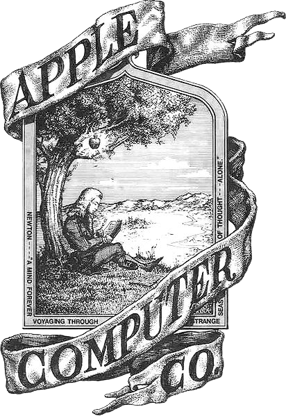
Apple's first logo, designed by Ron Wayne, depicts Sir Isaac Newton sitting under an apple tree. It was almost immediately replaced by Rob Janoff's "rainbow Apple", the now-familiar rainbow-colored silhouette of an apple with a bite taken out of it. Janoff presented Jobs with several different monochromatic themes for the "bitten" logo, and Jobs immediately took a liking to it. While Jobs liked the logo, he insisted it be in color to humanize the company. The logo was designed with a bite so that it would not be confused with a cherry. The colored stripes were conceived to make the logo more accessible, and to represent the fact the Apple II could generate graphics in color. This logo is often erroneously referred to as a tribute to Alan Turing, with the bite mark a reference to his method of suicide. Both Janoff and Apple deny any homage to Turing in the design of the logo.
In 1998, with the roll-out of the new iMac, Apple discontinued the rainbow theme and began to use monochromatic themes, nearly identical in shape to its previous rainbow incarnation, on various products, packaging and advertising. An Aqua-themed version of the monochrome logo was used from 2001–2003, and a Glass-themed version has been used since 2003.
Steve Jobs and Steve Wozniak were Beatles fans, but Apple Inc. had trademark issues with Apple Corps Ltd., a multimedia company started by The Beatles in 1967, involving their name and logo. This resulted in a series of lawsuits and tension between the two companies. These issues ended with settling of their most recent lawsuit in 2007.
The first advertisement of launching of Macintosh was quite adorable.
The first advertisement of launching of Macintosh was quite adorable.
Thursday, 17 January 2013
About ME
I’ve completed my Bachelors of Visual Arts from M.S. University, Baroda.
I’ve done internship for 3 months at LOWE, Mumbai.
Now I am studying Advertising at Sheridan college.
You can contact me through
Email : rraj.panchal@gmail.com
Portfolio : http://www.scribd.com/doc/74605500/PDF-Portfolio
Objectives
Passionate Visual Arts student with six months of experience in advertising agency seeking an opportunity to build a long term career in Advertising Industry, to be part of a team of talented, passionate individuals with a shared focus on working together to define a great experience. Want to turn career potential into performance that is recognized and rewarded.
Relevant Skills
- Ability to adapt new and changing environment.
- Think ‘outside-the-box’ and generate innovative ideas.
- Positive ‘Can - Do’ Attitude.
- Establish highly effective working relationships with clients and colleagues of diverse backgrounds.
- Work as an effective team member by making useful contributions, appreciating others’ opinions and contributions, encouraging and sharing success.
- Well-developed written and verbal communication skills.
- Customer service oriented with exceptional listening skills.
- Use of creative ideas in the field needed.
Experience
Creative
(Lowe Lintas Pvt Ltd, Mumbai)
- Creating advertising layouts for the firm.
- Use the creative ideas for the product to design the new prototype.
- Customer Service for the existing customers.
- Cartoon Illustration for the different characters.
Subscribe to:
Posts (Atom)


